Stats Dashboard
01
Context
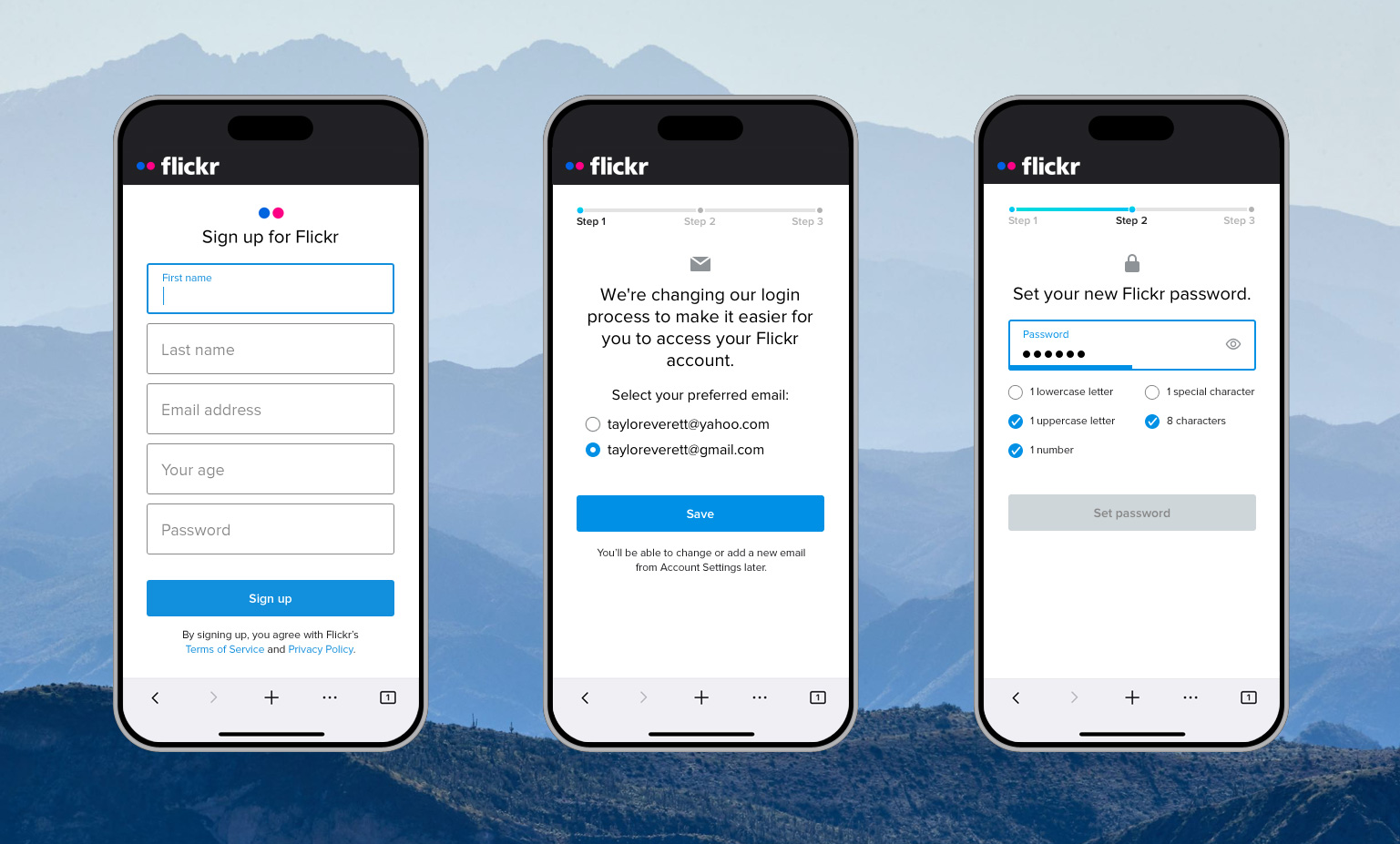
Flickr was a photo and video hosting service and an online community for photographers. Flickr’s main revenue source was a subscription service called Flickr Pro. Pro members received a dashboard of daily aggregated data about activity on their photos and videos as part of their subscription. We rebuilt the feature to improve functionality and test new front-end technologies.
02
Goals
There were two main problems we were looking to solve.
On the business side, we wanted to improve our subscription revenues by adding value through Pro feature improvements. On the engineering side, we wanted to update our front-end tech stack to NextJS and needed a self-contained feature to prove out the workflow.
The stats dashboard redesign project solved both problems. It was a highly valued feature among our Pros, many of whom used it daily and actively sought improvements. It was also a standalone feature page without many dependencies in the product, which made it an ideal place to start for our NextJS migration.
The stats dashboard redesign project aimed to:
03
Discovery
We knew from our recent Kano survey that the stats dashboard was a “Performance” feature for our Pro subscribers. This meant that if we increased the quantity and quality of statistical data, satisfaction with the feature would increase as well.
Our Pros also told us about specific pain points and desires via freeform feedback in the Kano survey and in our public Help Forum. Addressing these points would help us reduce subscription churn. Popular requests included:
We then surveyed our free members to understand their awareness and desire for certain Pro features, including stats. We learned that improvement and marketing of the new stats dashboard would help us increase new subscriptions.
04
Ideation
We prototyped a variety of concepts for the new stats dashboard, and shared them with our Alpha Group for testing and in-depth discussion. The Alpha Group was a group of enthusiastic users who are consulted for early feedback.
One of our biggest challenges was how the main chart should display data. Our first approach was akin to a stock graph, with toggles to show data over a specified time period, such as a week or month at a time. This approach did not provide a great experience in a responsive layout and with touch screens. Users also wanted to see day-by-day data, instead of aggregated weeks or months.

A simple solution that also delighted our Pros was to chart daily totals, paginated in an intuitive carousel format (see design below). We could expand the chart window to show more days at a time on larger screens, and shrink it to show fewer days at a time on smaller screens.
05
Designs
Once we integrated the prototype feedback and factored in technological and privacy limitations, we had our final list of improvements for stats:

The feature spent a few weeks in limited release, after which we launched the new stats dashboard to everyone.
06
Results
Love the layout change, makes this easier to read. And works better than the old version. E.g. there used to be a certain awkwardness when unfolding sources categories, that’s much smoother now.
Torben F., Flickr Pro + MEMBER SINCE 2005
Looks much improved thanks. I got so fed up with navigating the tiny Sources window of the old version. Having all the daily stats at the top makes sense too. For once, a change I like 😉
Bruce C., FLICKR PRO + MEMBER SINCE 2006
Expanding the timeline to 9 months is GREAT!
And the CSV file is a wonderful idea, thank you very much.
Wim D., Flickr Pro + MEMBER SINCE 2019